.
The Brochure Series
OF ARCHITECTURAL ILLUSTRATION.
| Vol. I. | APRIL, 1895. | No. 4. |
BYZANTINE-ROMANESQUE WINDOWS IN SOUTHERN ITALY.
The collection of photographs from which the plates in this and the February number were selected was only recently made under the direction of Signor Boni, an official of the Italian government, charged with the care and restoration of historic monuments.
The province of Apulia has been so little invaded by the march of modern improvement, and its present inhabitants are, as a rule, so poor, that it is difficult to travel here except on the line of a few main thoroughfares, and strangers seldom visit more than one or two of the principal towns on the coast. Bari and Brindisi are known to tourists, as they are in the line of travel to and from Greece, but the inland towns are isolated in a barren priest-ridden country in which strangers are not welcome. The hardships which it is necessary to face deter all but the most adventurous even of the Italians, familiar with the language and manners of the people. Architects seldom visit this neighborhood, and little is known of its rich treasure of mediæval buildings, except through the few published works treating of it. Signor Boni expressed himself as surprised at the great amount of beautiful work scattered through this region, of which he previously had no knowledge. The opinion of Fergusson has already been quoted in the preceding article.
The mixture in the work here illustrated of Byzantine and Romanesque elements has also been referred to in the preceding article, but the special characteristics of each style were not particularly pointed out. In the present consideration the peculiarities of detail and ornament are all that need be taken up, as the views given furnish no opportunity for the study of plan or general design. The derivation of the Byzantine style was indicated in the March number of The Brochure Series in describing the Ravenna capitals there illustrated.
Byzantine conventional ornament appears to be of two types,—the one usually used in mosaics, of thin scrolls, terminating in flowers or symbols, displayed upon a ground which is much greater in quantity than is the ornament; the other, usually confined to sculpture, an intricate interlace of ribbon lines with spaces filled with Byzantine acanthus, the ornament much greater in proportion than the ground, which only shows in small separate pieces. Apart from these are the borders, occasionally of overlapping leaves, often of small repeated units, such as Greek crosses and squares and diamonds, or else meanders or guilloches. The guilloche takes a new form in Byzantine design, and instead of being a continuous succession of small circles enclosed in an interlacing ribbon, it assumes the form of alternating small[53] and large circles, or of small circles alternating with large squares, and often progressing in both directions at once, horizontally and perpendicularly, and thus forming an all-over pattern. The roses of ornament are often incorporated into this form of guilloche. Sculpture of the human form becomes more and more feeble and crude. The acanthus, however, went steadily through successive variation until it attained the virile form seen in the best Byzantine work. It is no longer the olive type of the Romans, or the heavy, stupid leaf of the earlier centuries of the Christian era, but has again turned towards the sharp-pointed, vigorous leaf of the Greeks. Its lobes are divided into three or five tines, each sharp at the tip; its centre lines, radiating from a central stem, bend like flames; its surfaces are concave, with deep V cutting, and it has one very marked peculiarity, that is, that as far as possible no tine is left displayed alone on the ground, but the tip of each is made to touch either the tip of a neighboring tine or the ribbon or moulding bounding the space in which the ornament occurs. The tines are of nearly equal size throughout, and the spaces of ground left by the ornament are also of comparatively equal size, and if possible symmetrically grouped. The one almost universal moulding is decorated with acanthus units, and the capitals have acanthus leaves around their bells. These caps are of two types. One, that is manifestly an adaptation of a classic cap, is a union of an Ionic and a Corinthian, or at other times of a Roman Doric and a Corinthian capital. The other is peculiar to Byzantine work, and is that shown in Plates XXI. to XXIV. in the last number. This cap, as at S. Vitale, is often supplemented by another plainer cap above. The lower cap has its faces decorated with scrolls, acanthus wreaths, etc., and usually the corners are strengthened with a decorative unit, leaf or other motive.
The difference between the Byzantine and the Romanesque arises from the differences of the races and their environments. The art of seaport towns, when Commerce was most largely carried on by sea, much more nearly resembled the art of some great commercial centre on the seaboard than it did that of its own neighbors inland.
The art of the seaboard cities in Europe was, then, for many years a borrowed art from the East, as their people were to great extent Eastern colonists. It was carried on with a full knowledge of constructive methods, and a facility in obtaining materials that the inland towns did not possess; and in consequence it is along the seaboard that is to be found the persistence of the Byzantine influence. On the other hand, the interior was peopled by descendants of Ostrogothic tribes mingling with numberless local peoples. Whatever they touch is necessarily crude at first, but constantly gaining as they gain facility in working. A precedent of some kind they must have, and they find it close at hand in the Roman basilicas. Uncertain, from the result of woful experiments, of arches of great span, they pack their columns close together and surmount them with sturdy little arches that have scarcely any thrust. This arcade of heavy columns carrying absurdly disproportionate arches is their only motive, and applied inside between aisles and nave, and outside in successive stories rising one above another. As the masons begin better to understand their art, the span of the arch increases, though a large arch for some time does duty merely as a discharging arch, and has smaller arches beneath and within it. The capitals, at first crude imitations of classic prototypes, soon become the field for the grotesque imagination of the workmen, and each differs from the other and is a mass of light and shade shot with all sorts of uncouth fancies. Wherever, for some constructive reason, a column is omitted against a wall, the capital becomes a corbel, carrying the arches. In many cases the corbels alone are used, and an arcaded corbel course becomes the favorite termination of a wall in the place of a classic entablature. Finally the arches are omitted, and the corbels alone support the eaves.
It will be noticed that while the Byzantine decorated the interior of the churches, the Romanesque builder merely constructed the interior and wrought out the most of his design upon the facade. As a large arch was to him for[55] a long time a tour de force, he naturally beautified the necessarily large entrance, and the beginning of the development of the beautiful Gothic portals is seen in the early Romanesque churches.
The Romanesque is an architecture of inertia, with arches heavily weighted by great masses of wall, and with broadly contrasting masses of light and shade. It does not depend for its effect upon intellectual quality beyond a rigorous sense of simplicity, or upon refinement of conception or detail, but rather upon size, picturesque mass, and staccato light and shade. The proportion of capital to column in quantity of surface was very slight. The proportion of voussoirs to arches naturally depended upon the size of the arch,—large voussoirs to large arches, small voussoirs to small arches. Columns were only grouped around piers and on either side of openings; and lastly, the natural development of the column in Romanesque work was toward attenuation,—the later and the better the work, the more slender became the columns, until at last they were merged into the Gothic multiple-columned piers. The carving upon the arch-mouldings is, to a great extent, geometric, consisting of numerous facets cut in the stone, lozenges, etc.; the so-called dogtooth moulding is a very favorite form of decoration. All these carved mouldings were picked out in color, usually in red and green. The acanthus in the Romanesque has lost much of its vigor, is flat, heavy-tipped, round-edged, and scratched with V-cuts, and the vine is the leaf preferred by designers. Frequently masses of wall are cut in geometric diaper patterns, also touched with color. Borders are not broad; and circular forms, except in the arches, are seldom used. Romanesque was a barbaric art at the best, and has the usual virtue of the barbarian,—a directness of attack at the problem in hand and a simplicity in treating it which is invigorating to see.
XXV. and XXVI.
WINDOWS IN THE CHURCH OF S. TERESIA, TRANI, ITALY.
These two windows have very little to suggest Byzantine influence in their design. The form and detail are essentially Romanesque, although there is a certain crispness and piquancy of treatment in the first (Plate XXV.) which belongs to the Byzantine work.
XXVII.
WINDOW IN THE FACADE OF THE BASILICA AT ALTAMURA, ITALY.
The employment of grotesque beasts supporting the columns at each side of this window is a very common device in the Italian Romanesque work. The use of a reversed capital in place of a base for the centre column is also a peculiar treatment frequently found in Romanesque work.
XXVIII.
WINDOWS IN THE FACADE OF S. GREGORIO, BARI, ITALY.
XXIX.
TRIFORIUM WINDOW IN THE CHURCH OF S. GREGORIO, BARI, ITALY.
The Byzantine architects used pierced stonework with great effect both in exterior and interior detail. The examples here shown are rather crude, but effective in the relative scale of parts.
XXX.
WINDOW IN THE APSE OF THE CATHEDRAL, BARI, ITALY.
The ornament about this window, especially that in the long panel below it and upon the cyma of the soffit above, is Byzantine in character, while the columns, with the exception of the capital of the one at the left, are much more Romanesque.
XXXI.
A WINDOW IN BITTONTO, ITALY.
This is not an especially beautiful example, but is an illustration of the direct and vigorous treatment of the early barbarian Romanesque builders.
XXXII.
WINDOW IN THE APSE OF THE CATHEDRAL, BITTONTO, ITALY.
In this case the beautiful and delicate Byzantine leafage can be seen on the mouldings of the arch above the window. As in several of the preceding examples, there is a curious mixture of the two styles.[57]
The Brochure Series
of Architectural Illustration.
PUBLISHED MONTHLY BY
BATES & GUILD,
6 BEACON STREET, BOSTON, MASS.
| Subscription Rates per year | 50 cents, in advance. |
| Special Club Rate for five subscriptions | $2.00. |
| Entered at the Boston Post Office as Second-class Matter. | |
Several weeks ago the stock of back numbers of The Brochure Series held to fill subscription orders was exhausted, and in future all subscriptions will have to be dated from the number current at the time the subscription is placed. All who wish to have the remaining numbers of this year should subscribe at once, as no back numbers will be kept in stock. The edition has been increased to 7,000 copies, and if the present rate of growth in the subscription department holds will shortly have to be doubled.
The judges in the recent competition for the Rotch Travelling Scholarship, Messrs. Cass Gilbert, George B. Post, and Frank Miles Day, have awarded the scholarship to William S. Aldrich. Mr. Aldrich has taken the examinations this year for the first time, although several of his unsuccessful rivals for the honor have entered before in years past. He has been for some time in the office of Mr. C. H. Blackall, and has been engaged upon important work, such as the new Tremont Temple, which is now approaching completion.
In 1884 he entered the Department of Architecture at the Massachusetts Institute of Technology, and completed the two years' special course in 1887, and then went to the office of Mr. John Calvin Stevens in Portland, Me. He afterwards worked in the Boston office of McKim, Mead & White, and in the office of Peabody & Stearns, where he was engaged upon the drawings for the buildings at the World's Fair. As will be seen, he has had a varied experience and is well equipped to make the best use of his opportunities for the next two years.
It has been the custom in recent years with the winners of the scholarship to delay their departure until midsummer or early fall, but Mr. Aldrich proposes to start in June. His plan of work has not yet been entirely fixed, but he will probably spend a large part of his time in Italy, working in conjunction with the American atelier at Rome.
The three other scholarships in which the same problem in design was employed have also been awarded. For the McKim Fellowship of Columbia College ten designs were submitted. The award was made to Mr. John Russell Pope of New York, a graduate from the school in the class of 1894. The Roman Scholarship was also awarded to Mr. Pope. In the competition for the latter twenty-three designs were entered, and besides the first award honorable mention was given to Mr. Henry E. Emery of Nyack, N. Y., Mr. Fellows of Chicago, and Mr. Bossange and Mr. Ayres of New York, graduates of Columbia College, and to Mr. Percy Ash of Philadelphia.
In the University of Pennsylvania Scholarship in Architecture there were six competitors, and the award was made to Mr. Percy Ash, a graduate of the University. Mr. Ash has also had several years' practical experience in the best offices of Philadelphia, such as those of Cope & Stewardson and Frank Miles Day & Bro.
Mr. H. L. Duhring, Jr., of the Senior class in the University, was given second place.
The American Architect, in an interesting notice of the recent exhibition of the Boston Society of Architects and Boston Architectural Club, takes the occasion to comment unfavorably upon the disfigurement of the catalogue by advertisements, which it says are "most excellent things in their proper place, but wholly out of place in an exhibition catalogue." Why this is so it is hard to see, unless the Architect believes that there is not advertising enough to go round, and that it should all be reserved for the trade and professional papers. At all events this is "kicking against the pricks," for it is well known that the expenses of such exhibitions cannot be met without some[59] outside assistance, and the most feasible plan that has been found for making both ends meet is to interest the dealers in materials used in the buildings represented in the exhibitions. As these dealers are seldom named on the drawings exhibited, it seems proper that some return should be made for their most valuable assistance, without which the exhibition would not be possible.
The Architect further says: "The position taken by the St. Louis Chapter A. I. A. was the proper and dignified one, and it ought to be followed elsewhere. The catalogue of their recent exhibition, although a much more costly one than either the Boston or the League catalogue, contains not a line of advertising matter." This is certainly an amusing misstatement. Instead of "not a line," this catalogue has more space devoted to advertising than any of the others mentioned. What it would have been without its sixty-four pages of advertising, yielding an income of at least $50 a page, we leave others to figure out. Some of these pages we should prefer to see treated differently, as they do detract from the illustrations which they face, and they are sprinkled full of water-closets, radiators, bath-tubs, and various other building appliances not especially artistic in their suggestiveness. Still there is considerable taste and care evinced in the arrangement of many of the pages, and they are well printed on good paper. Possibly this accounts for the failure of the Architect to recognize them as advertisements.
The dignified course, it seems to us, is that followed by the committee of the Boston exhibition. In this case a certain number of pages was reserved in the catalogue to be devoted to advertising, and the houses to be represented were given to understand that all would be treated alike. No cuts would be used, and the pages would all be set in type of uniform style, thus insuring a desirable ensemble. We think that the advertising when well presented adds to, rather than detracts from, the interest of a catalogue. Our only desire is to see it done in good taste. The display of plumbing apparatus and all manner of building appliances we do not consider in good taste in this place.
The secretaries of a number of the architectural clubs have very kindly responded to our request for notices and reports of their meetings and proceedings, and we are pleased to be able to give short reports of such occurrences as are of general interest. There are some clubs, however, from whom we have not yet heard, and we would suggest that it will be a help to all concerned if the secretaries of all the architectural clubs will furnish us with short accounts of their regular meetings and of any other occasions of importance. We shall be pleased also to publish any correspondence which will in any way further the interests of these organizations. We shall be glad to have The Brochure Series considered as the organ of communication between the various clubs, and will place our services at their command.
Books.
Examples of Colonial Architecture in Charleston, S. C., and Savannah, Ga. Compiled, photographed, and published by Edward A. Crane and E. E. Soderholtz, Boston Architectural Club, Boston. 50 plates, 11 x 14. $12.50.
How much the revival of the classic influence of the early colonial and the immediately succeeding period is going to prevail in the establishment of a distinctive American style of architecture it is now difficult or indeed impossible to determine; but at all events the reaction from the Queen Anne vagaries of ten years ago to the more severe mass and chaste detail of the recent so-called colonial houses is a step in the right direction, and we have much to be thankful for in the improvement which this tendency has wrought in our recent domestic architecture. Beautiful and admirable as some of the recent examples of this work are, very few show the subtle appreciation of design to be found in many of the older buildings which until the last year or two have been looked upon as merely the outgrown and cast-off work of an age much less refined than our own.
With the very general adoption of this style there has been an increased interest[61] in the few remaining fine old examples which are scattered over the Eastern and Middle States, and the best of these are now familiar to architects.
Few, however, know anything of the development of this style in the Southern States, and the work now before us will be a revelation to those who have not visited the neighborhood of Charleston and Savannah.
A large proportion of the plates is devoted to Charleston, which owes its wealth and in fact the greater part of its existence to the prosperous planters of former days, who made the city a winter resort.
The most notable house illustrated in the work is the William Bull Pringle house, built by Miles Brewton in 1760. It has long been famous as one of the finest houses in the country. Josiah Quincy, who was entertained by its first owner, speaks in enthusiastic terms of its beauty and the charm of its surroundings. Fourteen plates are devoted to illustrating its various features. The two-story portico with a Doric order below and Ionic above, relieved against the brick front laid in Flemish bond, the simple but well-designed iron fence, flanked on either side by a wall with massive brick posts covered with plaster, and all overgrown with a tangle of foliage, make up a fascinating picture. The view of the side gateway and a group of darky boys is wonderfully picturesque, besides being very suggestive as an architectural fragment.
The detail is delicate and refined, but as a rule lacks the force and vitality of the Northern work of the same period. The interior detail shows a marked French influence, especially in the ceilings, mantels, and stairway. The drawing-room, of which a double plate is given, is probably without doubt the finest colonial room in the country, and is certainly a fine piece of design all through.
One feature in planning which seems to be peculiar to this region, as it is not found in the houses at the North, is the location of the drawing-room, which is here on the second floor, usually extending entirely across the front of the house. There is seldom, however, any indication of this in the facade by a distinctive treatment of the second story. But the effect is seen in the interior by the greater importance naturally given to the staircase hall.
The Gibbs house, built in 1752, which is shown by several plates, is also very attractive. The two interior doorways shown on one plate are among the most refined that we can remember.
The entrance and staircase hall of the Gov. Bennett house will bear comparison with anything of its class to be found, and the plates showing it will be of especial value for interior work.
The Bull house is of a type apparently common in the older work of this region. It is square and covered with a hip roof. The front is divided into three bays, the centre and wider one crowned with a low gable or pediment. The main floor is high, leaving a basement below and no cellar; and the front door, an illustration of which we give herewith, is reached by a double flight of steps protected by an iron railing. Many of the houses are provided with high fences and massive gateposts. A number of the plates give fine examples of these and several very interesting pieces of iron work.
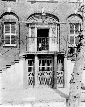 Doorway to the Bull House, Charleston.
Of the churches, St. Michael's and St. Philip's in Charleston are selected. The former was built in 1760, and is attributed to the English architect, Gibbs, who is also credited with the old Archdale house, with how good authority we do not know.[63]
On the whole, the choice of material is excellent. There is a large number of plates of detail which for architects' use are always the most valuable, and the work of the photographer and printer has been done unusually well.
Catalogue of the Joint Exhibition of the Boston Society of Architects and the Boston Architectural Club, April 15 to 21, 1895. Boston: Published for the exhibition by Bates & Guild. 96 pp., 36 illustrations. 35 cents.
A continuation of the general subject of exhibition catalogues touched upon in our last issue as far as it relates to the catalogue of the Boston Architectural Exhibition. The exhibition itself is quite small comparatively speaking, including only three hundred and twenty-five numbers, but, as the illustrations in the catalogue show, is widely representative and of a high grade of excellence. The contributions are very largely confined to members of the two societies under whose management the exhibition is held. This tends to give a somewhat local character to the exhibition as a whole. Still there is a sufficient number of important contributions from outside to make a quite respectable showing.
The selection of illustrations, the only ground upon which there is excuse for reviewing the publication, is unquestionably good. There are thirty-six in all, covering a wide range of subjects treated in a variety of ways. The reproductions are unusually good, and the book is neatly and well printed on good paper. The cover, designed by Mr. George G. Will, is especially attractive and good in design.
Club Notes.
Recruits in the already very considerable list of architectural clubs are still coming to the front. The latest to be heard from is the Architectural Club of San Francisco, which was organized on Feb. 26 with fourteen members, some of whom were members of the old Sketch Club of San Francisco. It is growing in membership, and gives promise of a bright future. Rooms have been secured in the Menisini Building, 231 Post Street. Meetings are held on the first Monday of each month, and a paper is read and the designs submitted in the monthly competitions are criticised and the awards announced. The first club exhibition will be held April 26. Mr. Loring P. Rixford, Room 24, Menisini Building, 231 Post Street, San Francisco, is secretary.
Brochure Series Competitions.
From time to time, as opportunity offers, competitions in design will be conducted by The Brochure Series. An upright or cabinet piano case, the subject of the first one, badly needs the attention of good designers.
The Henry F. Miller & Sons Piano Company of Boston have, for several years, made steady advancement in the artistic qualities of their piano cases. They have equipped their factory with a view to special work, and have unusually good facilities for getting out pianos to order, carrying out, architects' sketches or those of their own designers to harmonize with different styles of interior decoration.
It is their idea to encourage the special designing of piano cases, and to this end they have placed with the publishers fifty dollars to be divided into prizes for such designs. Only sketches will be required, their object being not to use the designs further than to publish the best, but to get designers to give a little attention to this particular problem, and so do a little towards creating an interest in the better design of piano cases. Full particulars, including a structural diagram and a statement of the technical requirements and limitations, will be announced in our next issue.
Personal.
As usual at this season, a number of architects and draughtsmen are planning to go abroad; some for only a few months, and others for a longer time. Among these are Messrs. H. T. Pratt, Matthew Sullivan, C. D. Maginnis, and H. C. Dunham, of Boston, and E. K. Taylor and H. L. Jones of New York.

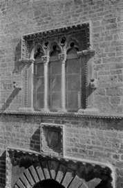 XXV. Window in the Church of S. Teresia, Trani, Italy.
 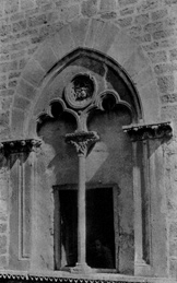 XXVI. Window in the Church of S. Teresia, Trani, Italy.
 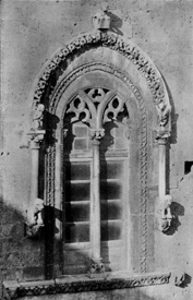 XXVII. Window in the Façade of the Basilica at Altamura, Italy.
 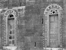 XXVIII. Windows in the Façade of S. Gregorio, Bari, Italy.
 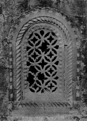 XXIX. Triforium Window in the Church of S. Gregorio, Bari, Italy.
 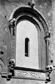 XXX. Window in the Apse of the Cathedral, Bari, Italy.
 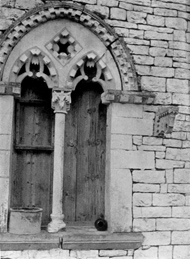 XXXI. A Window in Bittonto, Italy.
 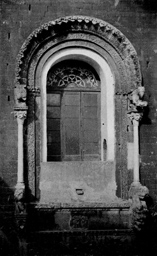 XXXII. Window in the Apse of the Cathedral, Bittonto, Italy.